


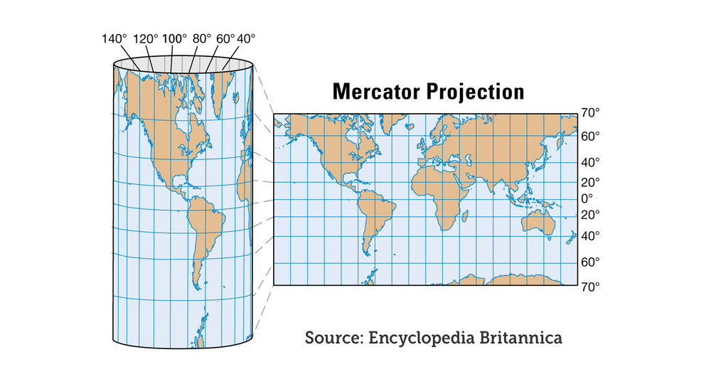
 From the time we enter elementary school until we graduate from high school, we’ve viewed the same map of the world hanging in front of the blackboard in geography class, the Mercator map. Most people don’t realize it, but this map grossly misrepresents the size of countries and contributes to confusion about the geography of our world.
According to Per Axbom, a Swedish communication theorist, “The Mercator projection (the map we use in our classrooms) was originally introduced by Flemish geographer and cartographer Gerardus Mercator back in 1569. Its purpose was for maritime navigation, and it served this purpose well since throughout the projection North is up and South is down, while local shapes and directions are maintained. So, when using this projection on a map scaled for navigational use it’s easier to find your way.”
In the Mercator projection the further a geographical feature is from the equator the bigger it appears because it is stretched out horizontally. A world map based on the Mercator projection is drawn as if the world was a cylinder rather than a globe. Antarctica is nowhere as large as it appears on the map. Greenland and Africa, for example, look to be practically the same size. Africa is about 14 times larger than Greenland.
“This also means that Europe and North America appear much larger than they really are in comparison to Central Africa and South America. Another favorite example of mine is Sweden superimposed on Madagascar. On a world map based on the Mercator projection Sweden appears to be at least twice the size of Madagascar; in fact, Madagascar is 30% larger than Sweden. Check this out for yourself the next time you look at a map of the world.